The following is a collection of a few monochromatic typographic IDs that I have developed over the last few years.
![]()
Everguide – Lifelounge – Melbourne - 2011
A custom serif based typeface used for an online and mobile gig guide.
![]()
Inspire 9 – Melbourne - 2012
A creative collective, communal workspace and incubator baed in Melbourne. The brief was to create something strong, approachable and friendly.
![]()
Lifelounge – Melbourne - 2008
Developed in conjunction with Duro Cubrilo for the creative culture website / magazine Lifelounge.
![]()
Personal Logo - 2012
An ornate swashy custom script for use on my own promtional material
![]()
Pipeburn Motorcycles – Sydney - 2011
Custom motorcycle collective. The brief was to take a contemporary approach to a classic script based ID.
![]()
Popmag – Lifelounge – Melbourne - 2011
Board sports magazine masthead design.
![]()
Ready Play – Tennis Australia – M&C Saatchi - 2012
Paint/ink based aggressive type.
![]()
Simulamos – 45 Doblecero 7 – Spain - 2009
![]()
Summadayze – Future Entertainment – Melbourne - 2010
Psychedellic inspired typographic ID for an Australian Summer music festival.
![]()
Tellurian Wines – Heathtcote - 2009
![]()
TheVine – Faifax Digital - 2010
Use of stylized vine shapes as the negative space between letters.
![]()
Tomorrow Media – Lifelounge - 2011
![]()
Play Cricket (draft) – Cricket Australia – Designworks - 2012
![]()
Harvesters Brewing Company – Yarra Valley - 2012
Custom script integrating a scythe in the H
![]()
Cilla de Nadai – Sydney 2012
Custom casual script typographic ID
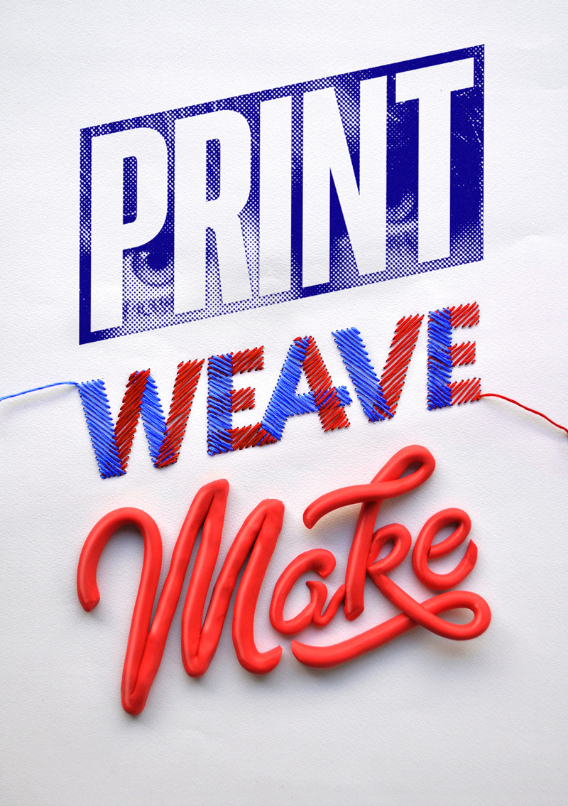 I was commissioned to create an ID for a series of open days that are happening this November at Craft, Australian Print Workshop and the Australian Tapestry Workshop.
I wanted to represent the hand crafted arts of the respective institutions through a hand crafted approach. My response was to develop a simple typographic ID and then created individual executions that represented the respective institutions texturally and aesthetically. Combining modelling clay, hand stitched letter forms and a coarse halftone pattern synonymous with the printing of yesterday I created a physical layout which I photographed and retouched.
I was commissioned to create an ID for a series of open days that are happening this November at Craft, Australian Print Workshop and the Australian Tapestry Workshop.
I wanted to represent the hand crafted arts of the respective institutions through a hand crafted approach. My response was to develop a simple typographic ID and then created individual executions that represented the respective institutions texturally and aesthetically. Combining modelling clay, hand stitched letter forms and a coarse halftone pattern synonymous with the printing of yesterday I created a physical layout which I photographed and retouched.


 Wednesday, April 4 2012
The theme for this quarterly investment outlook was based around the uncertainty of American retirees and their pensions and issues with the tax code 401(k).
Wednesday, April 4 2012
The theme for this quarterly investment outlook was based around the uncertainty of American retirees and their pensions and issues with the tax code 401(k). Wednesday, July 11 2012
The sentiment of the second financial quarter of 2012 saw a deflation in investor optimism. The brief for this illustration was to introduce a summery feel.
Wednesday, July 11 2012
The sentiment of the second financial quarter of 2012 saw a deflation in investor optimism. The brief for this illustration was to introduce a summery feel. Wednesday, October 3 2012
This illustration was supposed to represent post presidential election shenangians as the cover feature asks the question, "what cues will Wall Street take from the new party in power?"
Wednesday, October 3 2012
This illustration was supposed to represent post presidential election shenangians as the cover feature asks the question, "what cues will Wall Street take from the new party in power?" Wednesday, January 11 2012
This illustration was created for the Business section of the Washington Post as part of a wrap up of the fourth financial quarter of the year and has a focus on the best way for investors to navigate through the "Euro crisis".
Wednesday, January 11 2012
This illustration was created for the Business section of the Washington Post as part of a wrap up of the fourth financial quarter of the year and has a focus on the best way for investors to navigate through the "Euro crisis".


 I was recently invited to take part in an exhibition held at Melbourne's No Vacancy gallery named Half. The brief for the show was to create a piece that investigates the notion of half in an abstract or as literal a way as the artist desired.
My response was to look at the idea of commitment and the half-way point of indecision between the affirmative and the negative. Maybe... it could go either way.
Framed size: 72" x 52"
Materials: Hand embroidered french cotton in paper
I was recently invited to take part in an exhibition held at Melbourne's No Vacancy gallery named Half. The brief for the show was to create a piece that investigates the notion of half in an abstract or as literal a way as the artist desired.
My response was to look at the idea of commitment and the half-way point of indecision between the affirmative and the negative. Maybe... it could go either way.
Framed size: 72" x 52"
Materials: Hand embroidered french cotton in paper
 I was asked to take part in a group exhibition curated by letterpress extraordinaire design studio The Hungry Workshop called Rituals. A part of Art & About Sydney, the exhibition features original work from ten illustrators from around Australia including: Beci Orpin, Ben Ashton-Bell, Drunk Park, Eirian Chapman, Georgia Perry, Kindred Studio, Lauren Carney, Malade Pathetics, Spew Corp and yours truly.
Rituals explores the concept of identity, collaboration and the unintended compositions that come through the ritual of printmaking. Each artist was given the template of two eye shapes to build their artwork around and then The Hungry workshop experimented with overprinting multiple pieces which produced some amazing an unexpected results.
My contribution takes on inspiration from one of my favourite skate illustrators VCJ. I've recreated his iconic Bones Brigade, Powell Peralta / McGill skateboard graphic out of set type and combined it with patch details and the line Kern to Burn. If type geeks created a bikie gang this would make an excellent patch.
I was asked to take part in a group exhibition curated by letterpress extraordinaire design studio The Hungry Workshop called Rituals. A part of Art & About Sydney, the exhibition features original work from ten illustrators from around Australia including: Beci Orpin, Ben Ashton-Bell, Drunk Park, Eirian Chapman, Georgia Perry, Kindred Studio, Lauren Carney, Malade Pathetics, Spew Corp and yours truly.
Rituals explores the concept of identity, collaboration and the unintended compositions that come through the ritual of printmaking. Each artist was given the template of two eye shapes to build their artwork around and then The Hungry workshop experimented with overprinting multiple pieces which produced some amazing an unexpected results.
My contribution takes on inspiration from one of my favourite skate illustrators VCJ. I've recreated his iconic Bones Brigade, Powell Peralta / McGill skateboard graphic out of set type and combined it with patch details and the line Kern to Burn. If type geeks created a bikie gang this would make an excellent patch.


 and here's a detail graphic of one of the overprint.


 This is my submission for Alphabetica, a group exhibition held at Sydney's He Made She Made Gallery. Alphabetica is a three day exhibition where artists from around the world were invited to create their own interpretation of a designated letter with the aim to raise money for the Dandelion Support Network – a not-for-profit organisation that provides much needed baby equipment to less fortunate families in NSW and ACT.


 I created this candy cane inspired typographic illustration as an exploration in the limits of Spencerian style script for a end of year greeting card. These letterforms and line weights are defined through a sequence of shapes of various proportions a colours.
Wishing everyone all the best for the new year!
I created this candy cane inspired typographic illustration as an exploration in the limits of Spencerian style script for a end of year greeting card. These letterforms and line weights are defined through a sequence of shapes of various proportions a colours.
Wishing everyone all the best for the new year!


 I was commissioned to create a typographic ID and mouth illustration as part of a promotion for a new series of ice cream flavours for Nestlé / Peter's Drumstick. The artwork had to tie in with a larger campaign around the release of the new Pop and Rock "music inspired" flavours.
Agency: Publicis Mojo / Jack Winter
I was commissioned to create a typographic ID and mouth illustration as part of a promotion for a new series of ice cream flavours for Nestlé / Peter's Drumstick. The artwork had to tie in with a larger campaign around the release of the new Pop and Rock "music inspired" flavours.
Agency: Publicis Mojo / Jack Winter


 I was commissioned to create a series of illustrations to use throughout the Christmas edition of the Target branded magazine RED. Some of the illustrations created were for page backgrounds and type containers and others were ribbon based typographic illustrations.
Agency: Little & Company
I was commissioned to create a series of illustrations to use throughout the Christmas edition of the Target branded magazine RED. Some of the illustrations created were for page backgrounds and type containers and others were ribbon based typographic illustrations.
Agency: Little & Company
 Everguide – Lifelounge – Melbourne - 2011
A custom serif based typeface used for an online and mobile gig guide.
Everguide – Lifelounge – Melbourne - 2011
A custom serif based typeface used for an online and mobile gig guide.
 Inspire 9 – Melbourne - 2012
A creative collective, communal workspace and incubator baed in Melbourne. The brief was to create something strong, approachable and friendly.
Inspire 9 – Melbourne - 2012
A creative collective, communal workspace and incubator baed in Melbourne. The brief was to create something strong, approachable and friendly.
 Lifelounge – Melbourne - 2008
Developed in conjunction with Duro Cubrilo for the creative culture website / magazine Lifelounge.
Lifelounge – Melbourne - 2008
Developed in conjunction with Duro Cubrilo for the creative culture website / magazine Lifelounge.
 Personal Logo - 2012
An ornate swashy custom script for use on my own promtional material
Personal Logo - 2012
An ornate swashy custom script for use on my own promtional material Pipeburn Motorcycles – Sydney - 2011
Custom motorcycle collective. The brief was to take a contemporary approach to a classic script based ID.
Pipeburn Motorcycles – Sydney - 2011
Custom motorcycle collective. The brief was to take a contemporary approach to a classic script based ID.
 Popmag – Lifelounge – Melbourne - 2011
Board sports magazine masthead design.
Popmag – Lifelounge – Melbourne - 2011
Board sports magazine masthead design.
 Ready Play – Tennis Australia – M&C Saatchi - 2012
Paint/ink based aggressive type.
Ready Play – Tennis Australia – M&C Saatchi - 2012
Paint/ink based aggressive type. Simulamos – 45 Doblecero 7 – Spain - 2009
 Summadayze – Future Entertainment – Melbourne - 2010
Psychedellic inspired typographic ID for an Australian Summer music festival.
Summadayze – Future Entertainment – Melbourne - 2010
Psychedellic inspired typographic ID for an Australian Summer music festival.
 Tellurian Wines – Heathtcote - 2009
 TheVine – Faifax Digital - 2010
Use of stylized vine shapes as the negative space between letters.
TheVine – Faifax Digital - 2010
Use of stylized vine shapes as the negative space between letters.
 Tomorrow Media – Lifelounge - 2011


 Agency: DDB Melbourne
 Agency: Jacky Winter / Farago